Heartbase
Covering all the bases at this health foundation
Covering all the bases at this health foundation
Covering all the bases at this health foundation
WEB DESIGN
WEB DESIGN
BRAND
BRAND
MEDICAL CARE
MEDICAL CARE
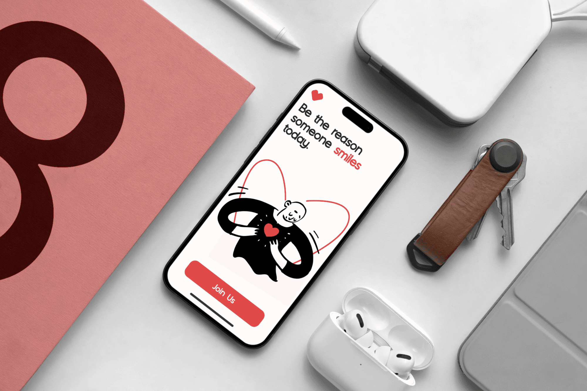
HeartBase had one big goal: be a solid pillar of support for people who couldn’t help themselves, medically or financially. They were based in Chicago, helping terminally ill patients get back on their feet, but they needed funding. That’s where we came in. We redesigned their website and added motion design, product cards, and graphics that grabbed attention. And the best part? It worked. HeartBase got their funding and we were there for the whole ride.
JUST KEEP SCROLLING
JUST KEEP SCROLLING
HeartBase exists to make sure no one faces serious illness alone or without support.
HeartBase exists to make sure no one faces serious illness alone or without support.
The goal was simple but heavy: help people who couldn’t afford the care they needed, both medically and financially. Because getting back on your feet shouldn’t depend on your situation it should be something everyone has a fair shot at.
The goal was simple but heavy: help people who couldn’t afford the care they needed, both medically and financially. Because getting back on your feet shouldn’t depend on your situation it should be something everyone has a fair shot at.

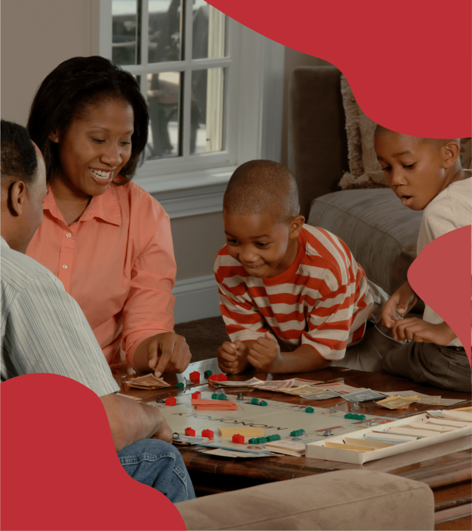
HeartBase was never trying to be just another charity. The focus was always on real people, real situations, and real care. People dealing with serious illness already have enough going on, so the goal was to make support feel simple, human, and actually helpful not cold or complicated.
HeartBase was never trying to be just another charity. The focus was always on real people, real situations, and real care. People dealing with serious illness already have enough going on, so the goal was to make support feel simple, human, and actually helpful not cold or complicated.


When everything feels clear from the start
When everything feels clear from the start
At the same time, everything had to feel trustworthy and clear. When people are looking for help or trying to give it, there should be no confusion or second guessing. Just a space that feels honest, supportive, and easy to connect with, where everything makes sense at a glance.
Because in moments like this, people don’t need complexity. They need clarity, reassurance, and a reason to trust that help is real and within reach.
We brought it to life with…
We brought it to life with…
We brought it to life with…

It started with color. Not just any red, but deep, warm tones that felt human. Not alarming, not harsh just enough to hold emotion without overwhelming it. Because this isn’t a brand that should shout. It should feel like presence, like care, like something steady you can lean on. So we built a palette around that feeling. Reds that carry weight, balanced with soft whites that give room to breathe.
It started with color. Not just any red, but deep, warm tones that felt human. Not alarming, not harsh just enough to hold emotion without overwhelming it. Because this isn’t a brand that should shout. It should feel like presence, like care, like something steady you can lean on. So we built a palette around that feeling. Reds that carry weight, balanced with soft whites that give room to breathe.

Then we looked at what they already had. The logo didn’t need to be thrown away it just needed to be understood better. So we refined it, reused it where it made sense, and made sure it could actually live across everything without feeling lost. It became more than a mark. It became something familiar. Something people could recognize in moments that matter.


Typography was where things really clicked.
We introduced Glyke Grotesque a clean, modern grotesque that does something very important without trying too hard. It feels clear. It feels steady. And in a space where people are already overwhelmed, that clarity matters more than anything. Every word needed to be easy to read, easy to trust, and easy to follow. No distractions. No noise. Just communication that works.

And then came the visuals. Nothing random, nothing extra. Just illustrations that felt intentional, soft, and human built around the same red and white tones to match the heart of the brand. Not just there to decorate, but to quietly reinforce what HeartBase stands for.
Because this wasn’t just about making things look good. It was about making people stop, understand, and feel something. Shining a light on what’s often overlooked, and making it easier to ask for help or give it.Every choice came back to that. Helping HeartBase show up in a way that actually helps.

When the story became clear enough for people to believe in
When the story became clear enough for people to believe in
Before anything even went fully live, the shift was already happening. With a stronger brand and clearer message, HeartBase finally started to feel real something people could trust at a glance.
Before anything even went fully live, the shift was already happening. With a stronger brand and clearer message, HeartBase finally started to feel real something people could trust at a glance.

Engagement and early interest jumped by over 60%, and for once, people weren’t just passing by… they were actually paying attention.
Engagement and early interest jumped by over 60%, and for once, people weren’t just passing by… they were actually paying attention.

“Working with them made everything feel clearer. What started as just an idea became something people could truly understand and believe in. They brought our mission to life in a way that made others want to be part of it and that changed everything.,”
“Working with them made everything feel clearer. What started as just an idea became something people could truly understand and believe in. They brought our mission to life in a way that made others want to be part of it and that changed everything.,”
“Working with them made everything feel clearer. What started as just an idea became something people could truly understand and believe in. They brought our mission to life in a way that made others want to be part of it and that changed everything.,”

Stephen Gawrit
Stephen Gawrit
Stephen Gawrit
VP of Sales and Marketing
VP of Sales and Marketing
VP of Sales and Marketing
Heartbase Foundation
Heartbase Foundation
Heartbase Foundation
LUMIN