keytone
Unlocking their entry into the investment market.
Unlocking their entry into the investment market.
Unlocking their entry into the investment market.
PRODUCT DESIGN
PRODUCT DESIGN
STRATEGY
STRATEGY
INVESTMENT & FINANCE
FINANCE
We got brought in to work on Keytone when things were moving fast, but the idea was clear: helping people and businesses find the right trending markets so their money, positioning, and image work in their favor, and making sure they show up with clarity so people could see the value and start backing it even before launch.
JUST KEEP SCROLLING
JUST KEEP SCROLLING
We're Unlocking Smarter Moves in the Market
We're Unlocking Smarter Moves in the Market
Our mission was to help people and businesses make smarter investment decisions. The focus on clarity, strategy, and timing to make sure clients "show up" confidently in the right spaces and act on opportunities when it matters.
Our mission was to help people and businesses make smarter investment decisions. The focus on clarity, strategy, and timing to make sure clients "show up" confidently in the right spaces and act on opportunities when it matters.

They help people put their resources where they’ll make the biggest impact. By spotting trending markets and high-return areas, they guide clients to invest smartly in the spots that really matter. It’s not just about numbers, it’s about understanding why each move counts, staying ahead of trends, and making confident decisions that actually grow money and position.
They help people put their resources where they’ll make the biggest impact. By spotting trending markets and high-return areas, they guide clients to invest smartly in the spots that really matter. It’s not just about numbers, it’s about understanding why each move counts, staying ahead of trends, and making confident decisions that actually grow money and position.
Things were moving fast and the launch was way behind schedule, so they had to hit the ground running. The goal was simple: make a digital presence that grabbed attention, built hype, and showed people the value even before the full product dropped. The tricky part? Doing it all without turning it into a mess, keeping every piece clean, clear, and telling the story the right way.
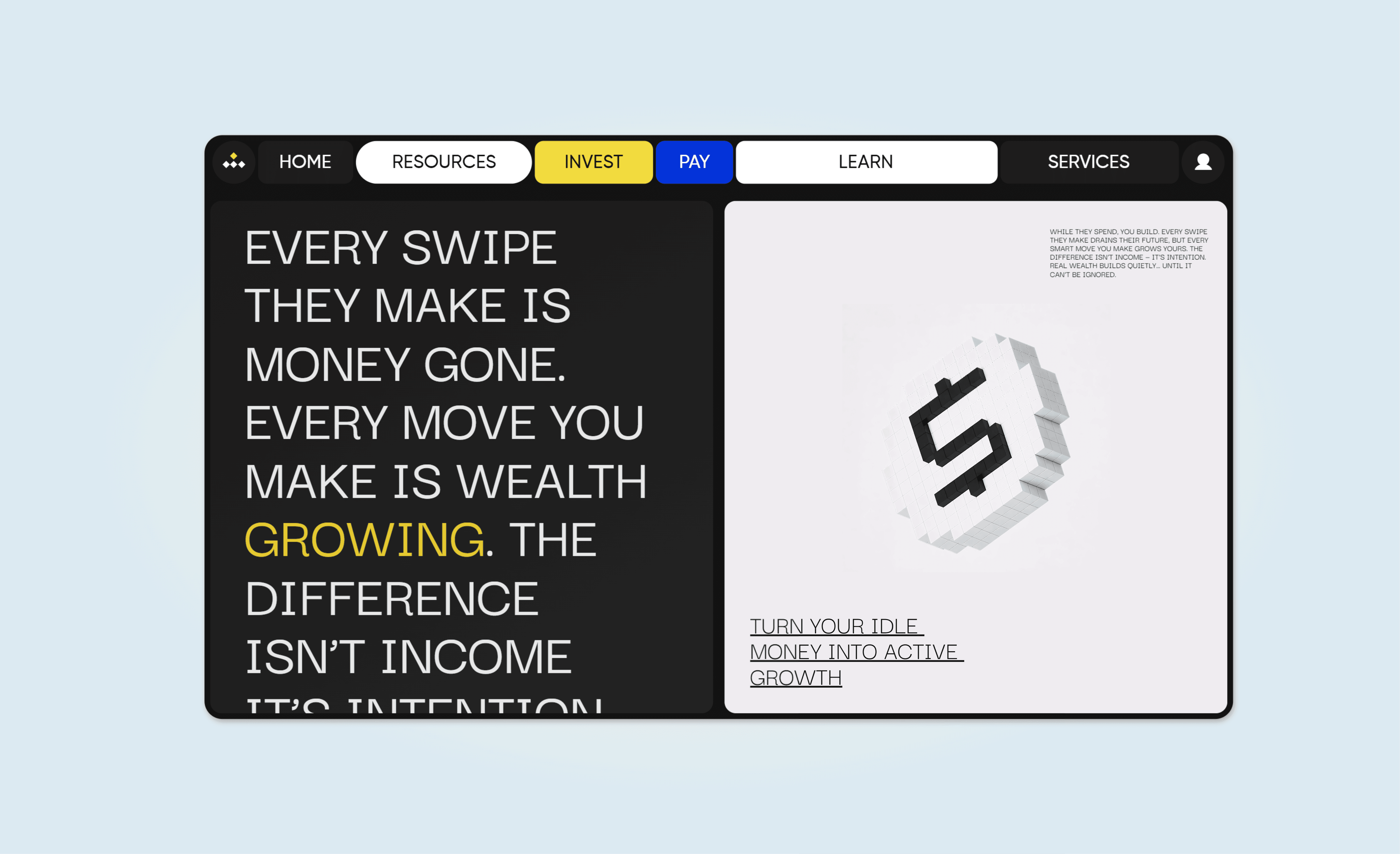
The real magic came with the 3D digital assets pixel objects that actually represent every move in the digital market. These aren’t just pretty graphics; they track trends, map opportunities, and make the chaos of the market feel… real. Online, they created a space where clients could spot the next big thing, see why each move matters, and make smart calls without guessing. It’s like turning abstract numbers into something you can actually see, touch, and play with giving people the confidence to chase the spots that really deliver the impact.
Things were moving fast and the launch was way behind schedule, so they had to hit the ground running. The goal was simple: make a digital presence that grabbed attention, built hype, and showed people the value even before the full product dropped. The tricky part? Doing it all without turning it into a mess, keeping every piece clean, clear, and telling the story the right way.
The real magic came with the 3D digital assets pixel objects that actually represent every move in the digital market. These aren’t just pretty graphics; they track trends, map opportunities, and make the chaos of the market feel… real. Online, they created a space where clients could spot the next big thing, see why each move matters, and make smart calls without guessing. It’s like turning abstract numbers into something you can actually see, touch, and play with giving people the confidence to chase the spots that really deliver the impact.


We worked on the visuals, playing with light and dark backgrounds that made the blue and yellow pop just right. Typography was all about "Darker Grotesque", clean and bold, keeping everything readable but full of personality. Every choice was about making the brand instantly recognizable and easy to interact with, while keeping it fun and modern.
We worked on the visuals, playing with light and dark backgrounds that made the blue and yellow pop just right. Typography was all about "Darker Grotesque", clean and bold, keeping everything readable but full of personality. Every choice was about making the brand instantly recognizable and easy to interact with, while keeping it fun and modern.

We turned their presence into visible value in the digital investment space.
We turned their presence into visible value in the digital investment space.
We tracked every move they made and turned it into something people could actually see and interact with. Traffic jumped 75% in the first two weeks, over 40% of visitors explored the 3D assets, and pre-launch signups hit 1,200+. Users started understanding why each move mattered, gaining confidence and taking smarter, more strategic actions in the market.
We tracked every move they made and turned it into something people could actually see and interact with. Traffic jumped 75% in the first two weeks, over 40% of visitors explored the 3D assets, and pre-launch signups hit 1,200+. Users started understanding why each move mattered, gaining confidence and taking smarter, more strategic actions in the market.

“,,They really helped us make sense of it all. An idea that was just floating around suddenly became something real and easy to understand. Everything came together, and people actually got excited to join in.,”
“,,They really helped us make sense of it all. An idea that was just floating around suddenly became something real and easy to understand. Everything came together, and people actually got excited to join in.,”
“,,They really helped us make sense of it all. An idea that was just floating around suddenly became something real and easy to understand. Everything came together, and people actually got excited to join in.,”

Stella Jin
Stella Jin
Co founder
Co founder
Co founder
Keytone Investment Planning
Keytone Investment Planning
Keytone Investment Planning
LUMIN