Helping these guys get their story straight
Helping these guys get their story straight
Helping these guys get their story straight
PRODUCT DESIGN
PRODUCT DESIGN
BRANDING
BRANDING
STORYTELLING
STORYTELLING
Pia is a branding studio built on storytelling helping brands communicate what their products actually mean in a way people can feel. But while they focused on the story, their own presence didn’t reflect it. It lacked clarity, presence, and the kind of first impression that makes people stay. And for a studio built on narrative, that gap started to show. So they came to us not to change who they were, but to help them show up with the same depth and intention they give to every brand they touch.
JUST KEEP SCROLLING
JUST KEEP SCROLLING
When the story tries to show up as clearly as it’s told
When the story tries to show up as clearly as it’s told
They were never trying to just make brands look good. The focus was always on meaning helping businesses express what they stand for in a way that feels clear and easy to connect with. But for that to truly work, it had to show in how they present themselves too, not just what they say.
They were never trying to just make brands look good. The focus was always on meaning helping businesses express what they stand for in a way that feels clear and easy to connect with. But for that to truly work, it had to show in how they present themselves too, not just what they say.

The focus was always on meaning helping brands express their values in a way that feels real, almost like reading something that actually stays with you. But beyond that, there was a dream of words going farther, reaching millions across different spaces, because in this era, the way you represent yourself is everything. Every decision, every word, every visual had to connect back to that so people could feel the story even before they heard it.
The focus was always on meaning helping brands express their values in a way that feels real, almost like reading something that actually stays with you. But beyond that, there was a dream of words going farther, reaching millions across different spaces, because in this era, the way you represent yourself is everything. Every decision, every word, every visual had to connect back to that so people could feel the story even before they heard it.

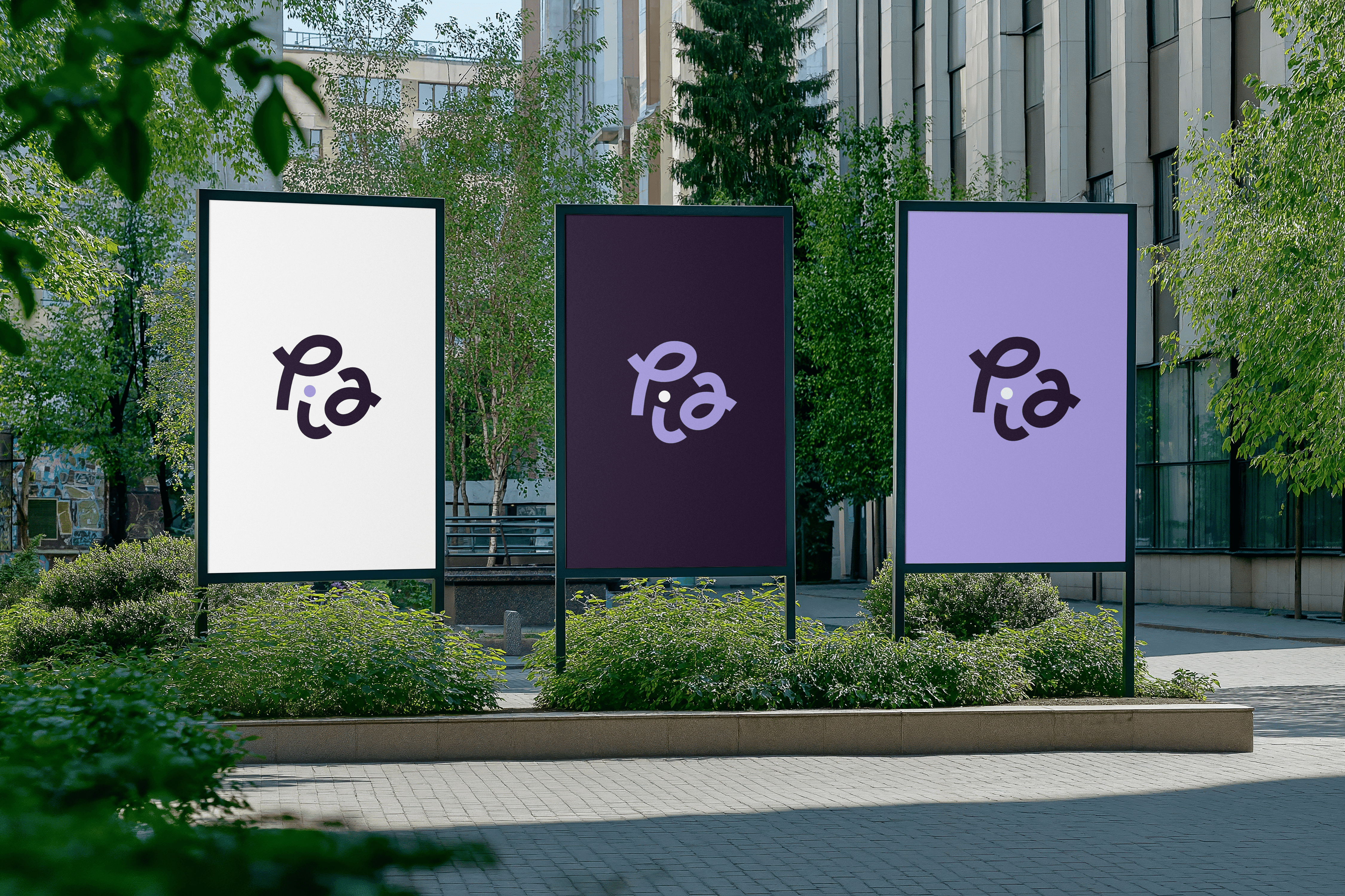
We tried designing a living canvas for their brand lavenders and purples, big curly doodles, motion graphics, and hand-drawn details all working together to guide users through their story.
We tried designing a living canvas for their brand lavenders and purples, big curly doodles, motion graphics, and hand-drawn details all working together to guide users through their story.
We tried designing a living canvas for their brand lavenders and purples, big curly doodles, motion graphics, and hand-drawn details all working together to guide users through their story.

Not just any typeface would do it had to reflect who they really were.
Not just any typeface would do it had to reflect who they really were.
Then came another challenge a brand that shines through storytelling needed the perfect font. After a bit of digging, we landed on one that really fit their perspective: a grotesque typeface called Stacion, similar to the popular Clash Display. It was unique, flexible across different design systems, and they loved how effortlessly it brought their personality to life.
Then came another challenge a brand that shines through storytelling needed the perfect font. After a bit of digging, we landed on one that really fit their perspective: a grotesque typeface called Stacion, similar to the popular Clash Display. It was unique, flexible across different design systems, and they loved how effortlessly it brought their personality to life.


3x more users interacted on first scroll across our social media, 5+ design systems brought colors, doodles, and motion to life, 100% client approval on font and visuals, and countless moments where the story landed before a word was read.
3x more users interacted on first scroll across our social media, 5+ design systems brought colors, doodles, and motion to life, 100% client approval on font and visuals, and countless moments where the story landed before a word was read.

In the end, every detail from colors and doodles to type and motion worked together so their story landed loud, clear, and exactly as they imagined.
In the end, every detail from colors and doodles to type and motion worked together so their story landed loud, clear, and exactly as they imagined.
“Working with this team was like finally seeing our own story reflected back at us. Every color, every doodle, every font choice just fits. It’s exactly how we wanted to show up and even better than we ever imagined…”
“Working with this team was like finally seeing our own story reflected back at us. Every color, every doodle, every font choice just fits. It’s exactly how we wanted to show up and even better than we ever imagined…”
“Working with this team was like finally seeing our own story reflected back at us. Every color, every doodle, every font choice just fits. It’s exactly how we wanted to show up and even better than we ever imagined…”
Sebastian Sommerer
Sebastian Sommerer
Sebastian Sommerer
Managing Director
Managing Director
Managing Director
Pia Media and Branding
Pia Media and Branding
Pia Media and Branding
LUMIN